ShopDreamUp AI ArtDreamUp
Deviation Actions


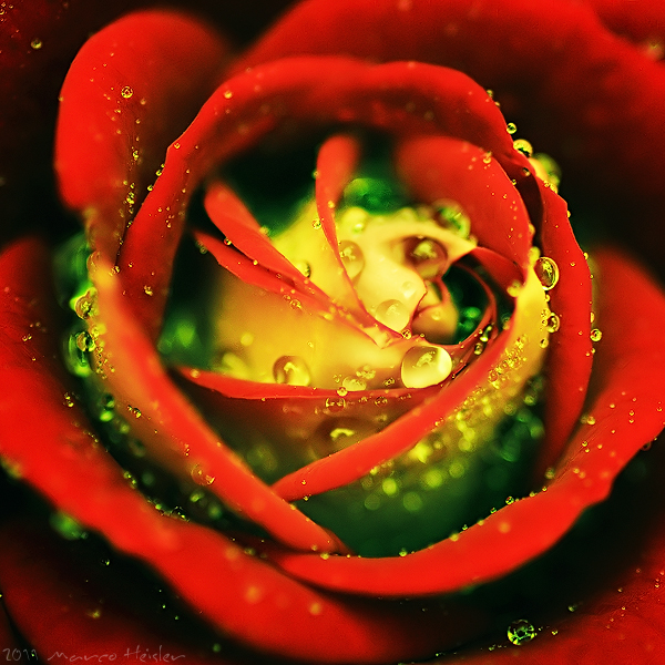
Description
equipment:
Nikon D300; Tamron 90mm 2.8 Macro; natural light.
Saturation/Color Balance edited, set the neutrals to green, cropped & resized in PS.
Thank you very much for viewing and all your support.
All my work is © Marco Heisler.
Please do not use it without my written permission.
Image size
600x600px 357.47 KB
Make
NIKON CORPORATION
Model
NIKON D300
Shutter Speed
10/3200 second
Aperture
F/4.5
Focal Length
90 mm
ISO Speed
400
Date Taken
Jul 14, 2009, 5:16:09 PM
© 2011 - 2024 MarcoHeisler
Comments185
Join the community to add your comment. Already a deviant? Log In
Vision: This is a stunning piece. It would look lovely on a cute romantic card, or on a book cover. The colors just draw you in. I like how you used complementary ones (red and green) to present them in the most beautiful way. The waterdroplets (and bokeh) complete this beautiful photograph. You can see the diversity of them; and the effect looks just like a morning dew.
Originality: I've seen many same concepts - flower closeups (especially roses) and waterdroplets on them. I can't say it's original, but its a great simple idea. The difference that you've made in creating your own version is mostly based on colors, and that makes it really different from the same concepts. Well done on that.
Technique: This piece is actually an example of how a good close up photo should look like. The focus is rather nice, as well as the use of selective colors. The only thing I found slightly disturbing is the blur effect, especially in the upper left corner. It looks like it was intentional in some parts of the image.
Impact: Even though we've seen the similar ones, this work is special and it's something I'll remember for a long time, especially because of the "red + green" you used. I don't know if it was intentional, but I like the symbolism of it. It reminds me of mature people with young souls. The center of the rose is still green, despite the fact that the rose has blossomed in all the red richness. Some people I know are just like that, and I think everyone should be - young souls.
Thank you for sharing this and well done.